 It's already been in the Guardian, but they only used five pictures for some baffling reason (humph). So I thought it'd be nice to share some more pics of my pride and joy. AKA my flat.
I live in the dodgy end of Wimbledon, in a top-floor two-bedroom Edwardian maisonette, which I bought in April 2011. Living in a maisonette means I get my own front door, which was a real draw for me. I'd been looking at lots of flats with shared entrances and my heart sank everytime. I guess I'm just woefully unsociable, but bumping into people when I'm in a massive rush to get out of the door in the morning is my idea of a nightmare.
Also, I used to live in a comparatively large three-bed semi (with an OUTBUILDING), so I've become a little spoilt.
I wasn't even meant to view this particular flat, but while I was viewing another, round the corner, the estate agent told me this one had come on and that it was nicer and bigger, and suggested I take a look. So I did. And got very excited - I couldn't believe that this two bed would be the same price as the one bed we'd just come from, but the estate agent just shrugged and said it was a little strange but yes, they were the same price. (It was his first day on the job.)
Cue me getting hugely excited. Then finding out on Monday, when I called to put in an offer, that he'd got the price wrong.
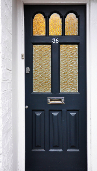
Thankfully I somehow managed to beg, borrow and steal the extra money so I could buy number 36.
And one of the first things I did was paint the front door, in Railings by Farrow & Ball.

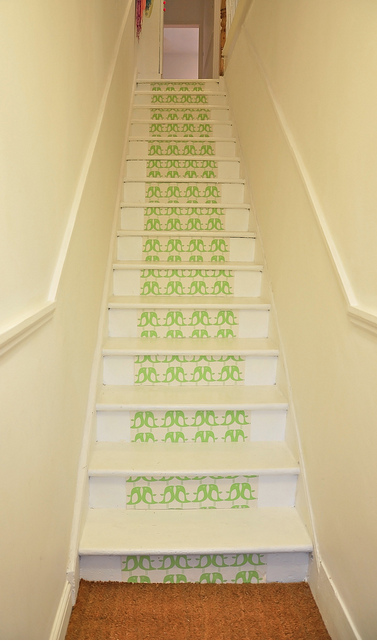
When I moved in, the hallway and stairs were carpeted, but I ripped the carpets out and painted all the floorboards white because the space felt very dark. Papering the stair risers is an idea I first saw in a reader home feature in Livingetc - the homeowner had used Orla Kiely wallpaper to do hers, but she’d papered all the way to the edges of each step. I decided to copy the look using this Isak wallpaper - I love subtle graphic prints like this. However, I just did a strip up the middle, so it mimics the original runner.
It’s actually the only wallpaper I have in the whole flat. I love wallpaper, but in my last home I went a bit feature-wall crazy, and found that I got tired of looking at the same pattern after a while. So in this flat I decided to add interest through soft furnishings and accessories instead, which are easier to replace when you fancy a change.
Hallway

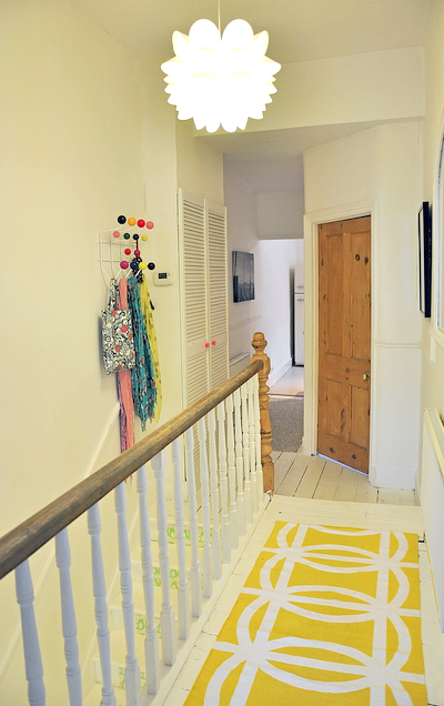
The hallway could really do with a replaster – don’t look too carefully or you’ll notice the bubbled lining paper! It was a magnolia dream when I moved in, so I slapped white paint over everything – including the floor – which immediately brightened the space.
With a totally white background, I’m free to play with splashes of colour. One of the first things I bought when I got the keys to this flat was the Eames’ Hang It All and it’s one of my favourite things. Like most people, I try not to hang much from it because it ruins the effect – which means it’s guilty of the style over substance sin, but I think we can forgive it…

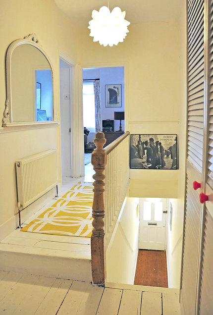
The rugs are from Zara Home and were bargains. The pink handles on the cupboard were also from Zara Home, and they’re a bit luminous for my liking, so I’m on the look out for a replacement. The big white mirror was originally gold and was a hand-me-down from my parents – I spray-painted it with plastic garden furniture paint.
The pendant is from Ikea and was only meant to be a cheap temporary buy until I found something I liked, but I really love it.
Living room

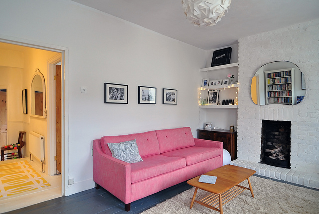
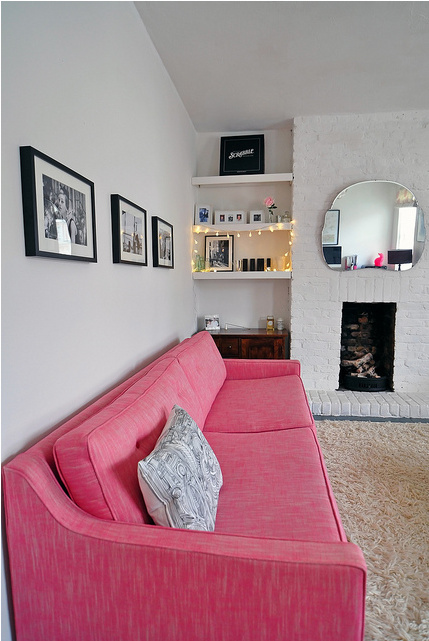
The living room is huge. It’s one of the things I love the most about the flat, and as it’s south-facing it gets lots of sun.
The sofa is the Fancy Nancy from Sofa Workshop and has been used in many, many magazine shoots! It’s got a subtle midcentury look that just works with pretty much any room setting. It’s all about the buttons and the piping, for me. I’d wanted it for about six years, but it was always too expensive. I literally used to harangue Sofa Workshop stores, asking them if they would sell me their display model, but as it was one of their signature pieces they said it was unlikely to ever be sold off. Then, one day, I was shopping and saw it in the window with a big red CLEARANCE tag on it, and marched in and told the rather stunned sales assistant that I had waited six years for it and that I had to buy it. I got about £1000 off, so I was really chuffed.
I choose pink because it’s a (surprisingly) easy colour to live with, bold without being dominant, and adds warmth to my white walls and grey floor, which is painted in Farrow & Ball’s Down Pipe. I’ve got a bit of a pink obsession, actually - I have to restrain myself.
I think colour is incredibly important in interiors, but personally I like to keep it restrained to a few bright splashes, set against a white background - this really maximizes the light and sense of space. Dark walls and lots of heavy patterns make me feel quite claustrophobic. White walls are also more forgiving on imperfections, which helps when you live in a period property that could really do with a replaster…
The Ercol table is an original 50s one found on eBay and is one of my favourite pieces of furniture - the patina of the teak top is just beautiful. The paper lampshade is from Habitat.
I found the mirror in a junk shop for £10. It’s an old dressing table mirror from the 1960s - I’d seen one reused in a similar way on one of the design blogs. It weighs a ton so I had to hang it with a huge chain.

The fairy lights are from Cox & Cox. I put them up for Christmas but they’re just too pretty to take down. I’m not into ornaments or clutter, and these shelves are the only place in the flat where I allow myself a few chosen items, mostly old family photos. And my deluxe Scrabble board, which is too big to fit into any cupboards!
Over the years working on interiors mags I’ve learnt that it’s not realistic to try to live in a ‘photoshoot’ room. It’s too sterile, and too impersonal. I’ve seen a lot of expensive homes that have been interior-designed to within an inch of their life, and to me, they often just look like hotel rooms. Your home should be a reflection of you.
Study area

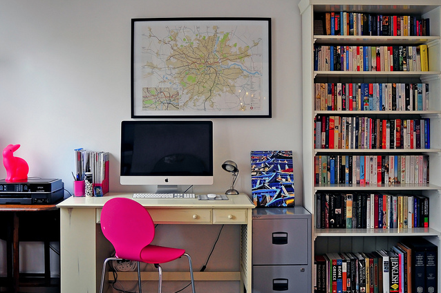
The bunny lamp was from The Little Baby Company. Yes it is meant for children! I’m a bit obsessed with lighting, the quirkier the better. Of course the fact that it’s pink doesn’t hurt either… I actually have six different forms of lighting in the living room - it might sound excessive but lighting changes my mood completely, and because this is a multi-purpose room, changing the lighting helps me get into the mood for work, or relaxation, or entertaining etc.
The chair is from the now defunct Chair Company and was one of the first things I ever bought when I was working for Kitchens, Bedrooms and Bathrooms magazine, a magazine with a very contemporary bent. It definitely influenced my tastes at the time. I had a lot of striped Designers Guild fabric in my life back then.
I’m a bit of a neat freak - I can’t concentrate if my desk is too cluttered, so I only have the essentials next to my computer. Everything else is anally filed away in my filing cabinet. I hate the filing cabinet - it’s industrial looking but not in a good way - and am on the lookout for a ‘softer’ alternative. I’m a fan of the Dulton drawer cabinets, but ideally I’d like something second-hand.
My work has really taught me to investigate the heritage of products - and I’d far rather wait and save for something that’s been lovingly designed and made than just get something cheap and mass-produced. At 100% Design last year I fell in love with a black walnut writing desk from new furniture company Young & Norgate, and that’s now top of my wishlist.
I’m also passionate about second hand furniture - I went to Ardingly last year and it was so inspiring. There’s so much beautiful stuff out there, just waiting to be loved again!
Kitchen

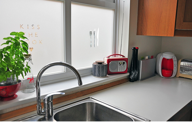
Because of the way the maisonettes in my road were built, my kitchen window looks directly across to next door’s kitchen window. There were no blinds up when I moved in, and I’m not a fan of soft materials in a kitchen anyway, so I decided to put window film up, so that I didn’t eyeball my next door neighbour while I was doing the washing up. This film is from Brume, who do a great range of different styles. It’s very easy to stick up, too.

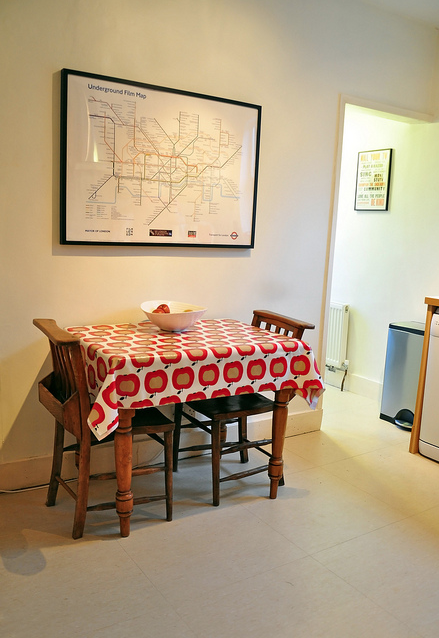
The kitchen was already fitted when I moved in, and it’s a nice oak design from Ikea (top tip: Ikea kitchens are brilliant and amazing value! Team with an expensive worktop and no one will ever know). I bought the little dining table at Ardingly last year – it’s Victorian and has a cute cutlery drawer on one side. The chairs are vintage chapel chairs. The oilcloth is from John Lewis.
What you can’t see in this picture is my cream Smeg Fab fridge-freezer - my pride and joy, and yes, admittedly another total interiors cliche.
Bedroom

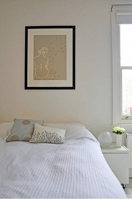
My bedroom is my favourite room. It’s very calm and peaceful, with white-painted floorboards (done myself over three days, back-breaking but satisfying work!) and walls. It’s not a huge room so, again, keeping everything white helps maximise the sense of space. Livingetc did a ‘white’ issue a few years ago, which proved that white doesn’t have to mean clinical, especially when you mix in textures, like my bashed-up floor and lacquered bedside table.
The screenprint above the bed is by Clare Cutts, and was a 30th birthday present to myself! I spotted it in a shop in Dartmouth and found myself thinking about it for the rest of the day, so I went back later and bought it. Total impulse buy, and my most expensive piece of art, but I love it, and it sets the tone for my bedroom as a relaxing haven.

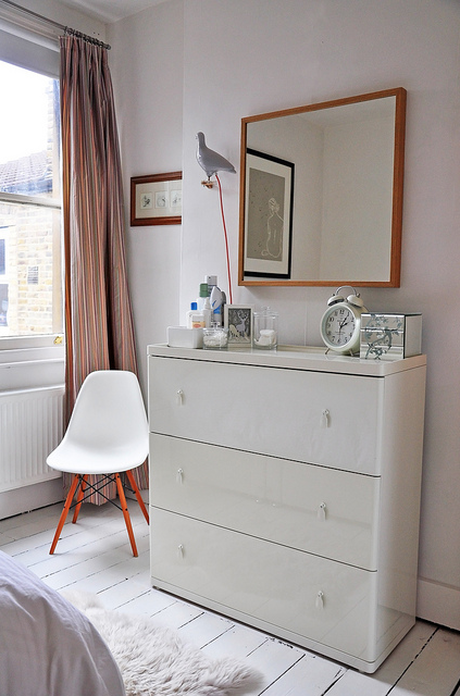
This room has a lovely airy feel that makes me feel like I’m on holiday somewhere warm every time I wake up. The curtains are a subtle striped silk, leftover from a magazine shoot. The chair is the Eames DSW from Vitra, and was the most amazing surprise 30th birthday present. The pigeon light is another design classic, by Ed Carpenter, from Thorsten Van Elten. The chest of drawers, sheepskin rug and oak-framed mirror are all Ikea.
My top tip is: buy what you love. Don’t buy what’s fashionable - buy things that, for whatever reason, you find it hard to walk away from.
Spare bedroom

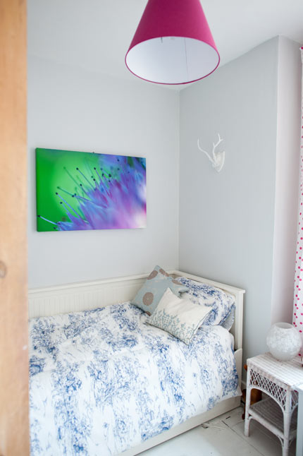
I'll admit it: the spare bedroom's been done on the cheap. The Ikea daybed was a hand-me-down from my parents, and behind the door is a tiny Ikea wardrobe (from their nursery range - it was the only one that would fit!). The painting above the bed is one of my sister's canvas-printed flower macros, and I love the colours in it. The plaster cast horns were a press gift from M&S.

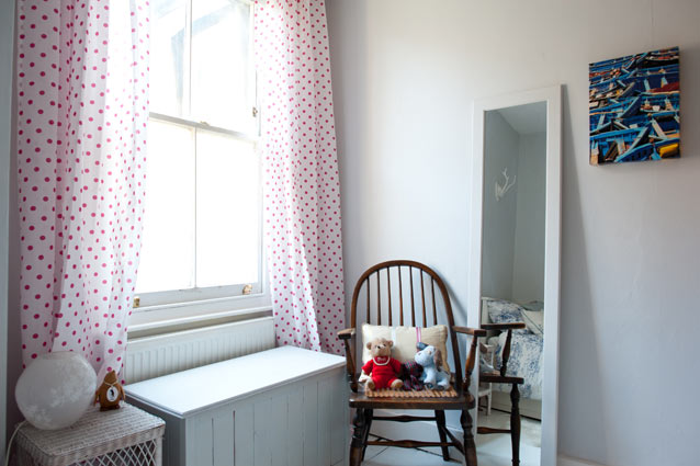
The other side of the room is dominated by the ridiculous pink polka dot curtains (also from Ikea), which I'm embarrassed to say I absolutely love. They do make the room look a bit like a little girl's room, however. I'm not sure a man would be comfortable sleeping in here! The lower window in this room is covered in wonderful window film by Emma Jeffs - a lace design. It's absolutely beautiful but unfortunately you can't really see it in the photo.
The chair was my grandfather's, and I inherited when he died. The mirror was a door on an old Ikea wardrobe, and the blanket box was my toybox when I was a kid. I painted it to match the mirror. The cushions are all Laura Ashley.
And the bathroom? That's a work in progress...
All photos the work of my super talented sister Sophie Duckworth.



 It's already been in the