
Thoughts on a cover
Check me out - nothing for months and then two posts in one week! Can you tell I'm sitting on my hands at the moment, waiting to hear what my agent thinks of my latest manuscript?!
I heard from my publisher today that the proofs for THE RIVAL are at their offices, and soon to be sent to other authors, press and bloggers in the hope that they will enjoy it and write about it (and on that note, if you are one of the aforementioned crowd and would like one, please let me know!).
So I thought it was high time I officially shared my cover! I put the cover on my main website a while ago, but it was done without any fanfare so I wanted to give it a little bit of appreciation. Especially as I genuinely love it.
What many readers might not know is that the author has nothing to do with the process of designing the cover. In fact, I hadn't heard a word about it until my editor randomly sent me their proposed cover out of the blue last year. My heart was properly thundering as I clicked on the attachment in her email, and I'm happy to say that it was love at first sight. I actually got goosebumps when I first looked at it, and I remember being both surprised and pleased at what the cover designer had come up with.
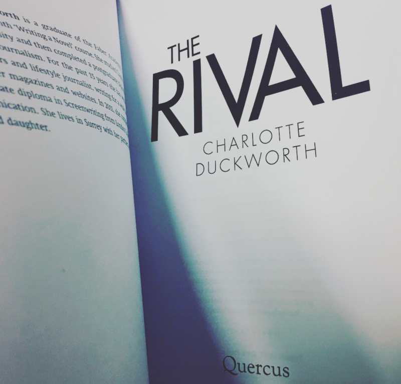
So without further ado.... here it is:

My first thought was that it was quite filmic, or even Netflixy, and that this was a Good Thing as I think it's targeted at a similar demographic. I was also so pleased that they'd used two distinct faces on the cover, rather than anything more oblique. Psych suspense/thriller covers often have close-ups of things like crushed rose petals on their covers and I was keen that my book would stand out a bit from that crowd. The expressions on the women's faces are absolutely perfect - it's really creepy and draws you in I think!
I was surprised by the black and red - I'd never thought about those colours being on my book, as it's a book about women and I guess (somewhat stupidly) I expected something a little softer. But I love how much it stands out, and I also love the blueish tint to the women's skin, which makes the whole thing look really dark and mysterious.
The strapline is bloody genius too, and I only wish I could claim credit for it, but, like the title, it was all the work of the clever team at Quercus.
Can you tell I love it?! I hope you like it too.
You can find out more about THE RIVAL on my website, and pre-order here if you want to make my day.