

Have a nose around my home office

Hello! Long time no blog. I am sorry, I have been embroiled in a complicated edit of book 3 and I tend to get very engrossed in one thing and find it hard then to do anything else. But I’m back now, and I thought it might be nice to give you a little virtual tour of my home office. If you follow me on Instagram you might know that it’s really different from the rest of our house.
“We had both lived in Victorian/Edwardian properties before this and while they’re very charming with their period features etc, we both really really love the spaciousness you get in midcentury homes”
We live in a 1970s house (I have blogged about it a bit here) and everything is very light, bright and spacious. Lots of glazing (far too much in some respects - especially when it’s warm, it’s like living in a greenhouse!) and just generally a lovely and airy feel. We had both lived in Victorian/Edwardian properties before this and while they’re very charming with their period features etc, we both really really love the spaciousness you get in midcentury homes. A proper hallway, rather than a narrow corridor dominated by a staircase. Big, square or rectangular rooms that make fitting in furniture easy. Huge windows that make the most of the views. There are lots of benefits.
But as usual I digress. The point is that when we moved in we really wanted to increase the sense of light and space further, so after we had our extension done last year we painted the entire downstairs white, and purposefully chose neutral furniture with lots of light wood and plywood - it’s very Scandi throughout I guess (although we do have some cool wallpapers in the bedrooms).
However, the one room in the house that doesn’t really fit with our ‘theme’ is my office. And that’s probably a result of us keeping artwork and accessories to a minimum downstairs. I am not hugely sentimental, but when it came to putting up finishing touches downstairs I had quite a few pieces that I was really upset we couldn’t find homes for. And so I decided to embrace it, and put them all in this little room. And so my home office is the one room in our house that’s, well, cluttered. I’d prefer to say homely, but cluttered is probably more accurate.

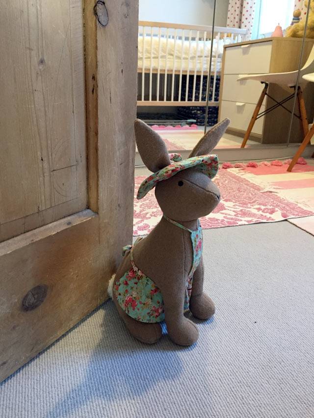
So here it is: my little room that looks nothing like the rest of the house. It’s the smallest bedroom upstairs, and it’s at the front of the house and overlooks a load of hedging and mature trees. We’re lucky that we live down a cul de sac which only has houses on one side - opposite us used to be a running track, which has been sold for development, but we should (if the planners keep their word) still have our natural screening of mature trees and hedging to separate us from the new houses (which will be in a different road). Bit hard to explain but hopefully it makes sense!
[Gross sidenote: the downside of living in an ultra quiet cul de sac quite near a station is that taxi drivers quite often come down here to relieve themselves in the bushes opposite. It’s LOVELY. They never realise I can see them out of my office window. One day I might shout out the window at one and give him a heart attack.]
Anyway, it’s a small room - you could squeeze a double bed in if you had to but it wouldn’t be very comfortable. But it’s plenty big enough for an office.
“I’m usually not a huge fan of gallery walls, but I think it works quite well and really does make me feel cocooned and cosy surrounded by the things I love”

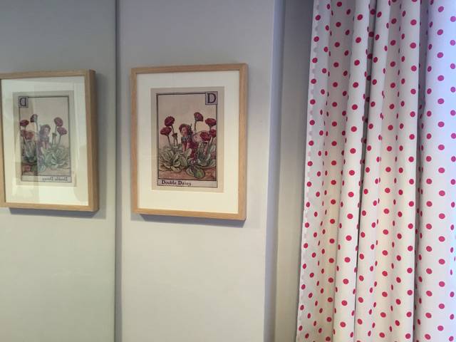
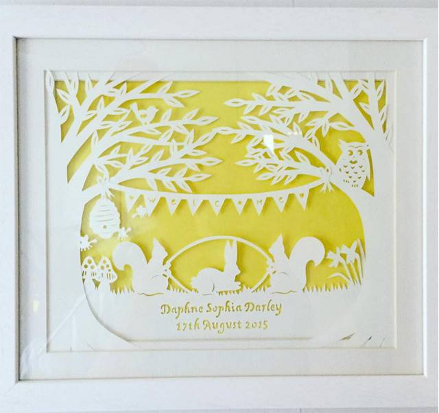
As you can see, on the walls I’ve basically ‘gone with it’ and decided to hang every picture that ever meant anything to me, so it’s a bit of a mish mash. I’m usually not a huge fan of gallery walls, but I think it works quite well and really does make me feel cocooned and cosy surrounded by the things I love. There’s photos of me and my sister, pictures taken by my sister (a very talented photographer), a photo of my insane father flying the aeroplane he built in his garage, plus the large Clare Cutts screen print that I bought on my 30th birthday. It’s a mish-mash, but I like it.
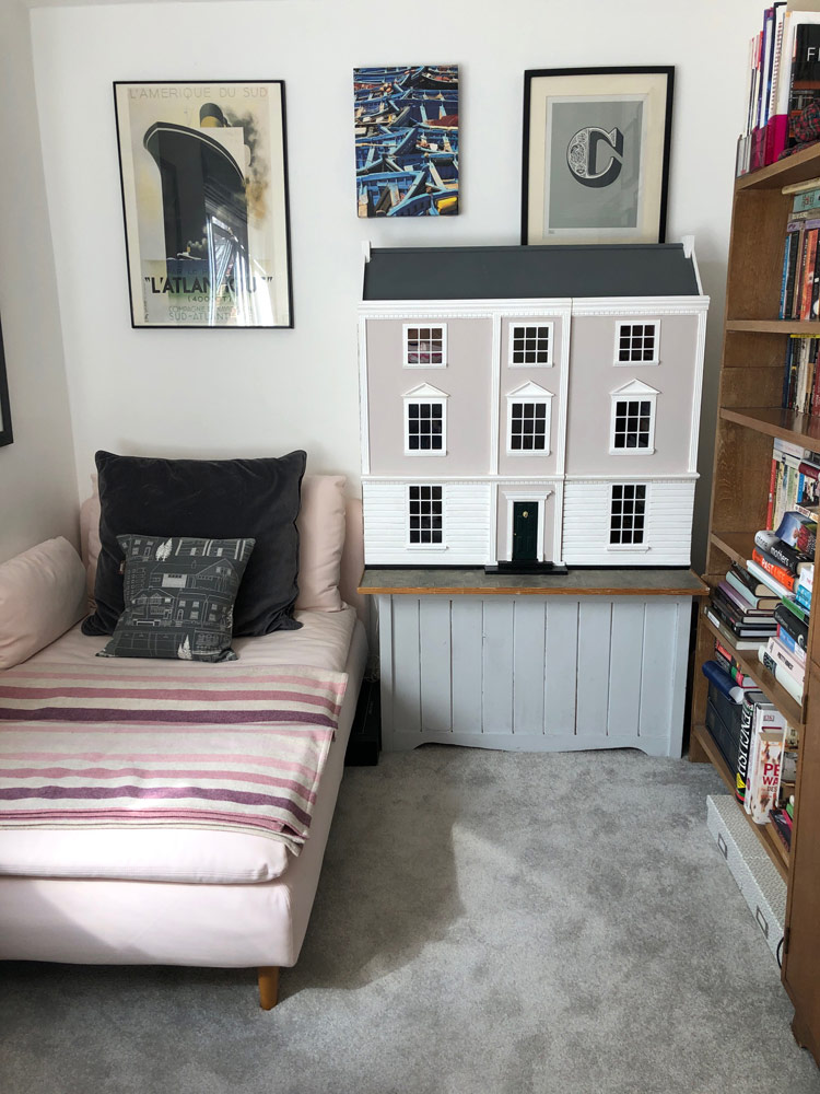
Furniture wise, there are two really precious things to me: my desk which is from Heal’s and by Sebastian Cox, and the little bureau that was my grandparents. The desk was a real extravagance but one which I have never regretted - it’s a pleasure to work at. The bureau reminds me of my childhood, because my Nanny used to keep all the family photos in the bottom cupboard and inevitably when we stayed with her I’d ask to dig them out and we’d go through them all together. It’s actually a really useful cupboard - we keep all our stationery bits in the flap-down section, printer paper and envelopes in the drawers and then the bottom cupboard houses all my paperwork. On top of the bureau is a vintage typewriter that Oli bought me for Christmas a few years after we got together. It works and I love it!

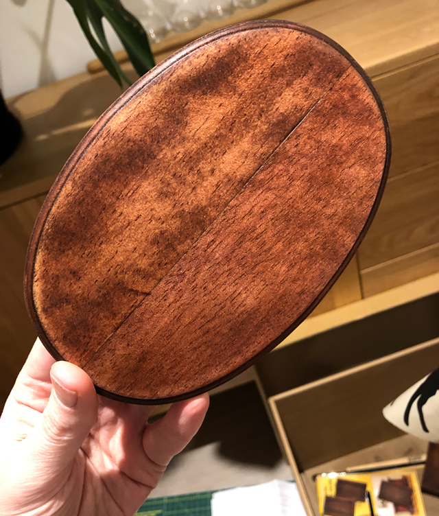
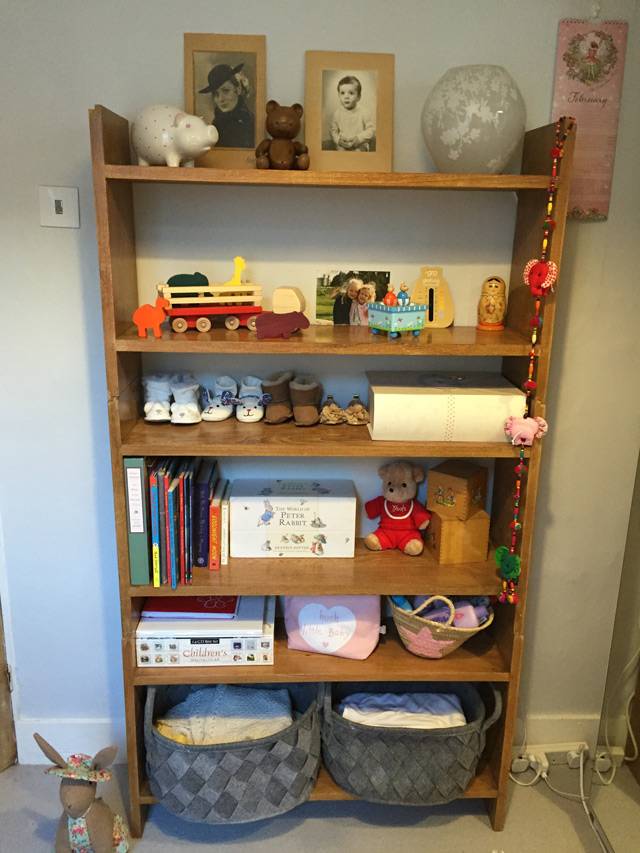
The oak stacking shelves are vintage Heal’s and were Oli’s - we have two more of them downstairs in our kitchen which house our cookery books. Then there’s of course my dolls house (which I’ve blogged about at length), which sits on top of my childhood toybox. It’s empty (there’s no moving that dolls house easily) and needs repainting but it’s another thing I can’t bear to part with - under the lid it has my sister’s and my childhood graffiti.

The daybed is from Ikea. It’s ridiculously comfy and it’s where I do most of my writing and editing. I love the soft pink colour and I usually have my Melin Tregwynt blanket over my legs while I work.

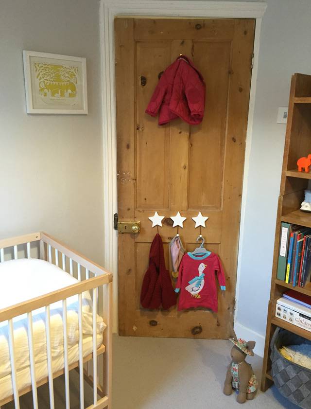
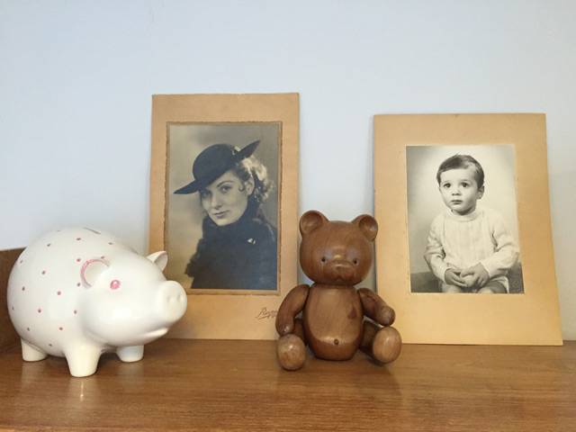
On the walls by my desk I have my vision board (I could probably blog more about this but being a Brit I’m still a bit embarrassed that I have one) and a set of String shelving with family photos on. We’re not hugely big on having family pics everywhere - we have one collage frame in the kitchen, and then a few of Daphne as a baby scattered about but no big canvases or anything like that. And barely any of us as a couple! So unromantic, ha.

The windowsill is home to all the plants that Oli won’t let me have in the rest of the house - mostly little ones. Plus my Lucie Kaas mini sparrow (I have a bigger one downstairs) and a radio I hardly ever turn on (I can only really work in silence).

And that’s about it! This room has such a different feel from the rest of the house. It’s not purposefully styled, everything that’s in here is in here because I love it, not because it necessarily looks ‘right’ with the other pieces. It’s a bit ramshackle and incohesive but somehow I find coming in here really comforting. Even though I love the bright contemporary simplicity of the rooms downstairs, this room is a cosy haven, and feels very ‘me’. My own little sanctuary, and I’m very lucky to have it.
Desk - Sebastian Cox from Heal’s. Shelves - vintage Heal’s. Pendant light - Tom Raffield. Daybed - Ikea. Chair - Setu by Herman Miller, John Lewis. String Pocket Shelving in Ash and White, Utility Design. Blanket - Melin Tregwynt. Clock - Wild and Wolf from Amara.
You can order my debut, The Rival, here. Unfollow Me is out now!

Our tiny 70s bathroom makeover

Ohhh this feels like a real trip down memory lane - to be blogging about interiors again! I thought it was a time to switch it up from the endless chat about writing/parenting, so here we are: the first in what I hope will be a series of posts all about our house renovation.
Now, nearly three years ago, when we first moved into our 70s house in suburbia, I did a little house tour post. You can see it here. I ended it by saying I was definitely going to do some posts on what we did to the house soon. Sorry! But better late than never huh?
Anyway, if you follow my Instagram you might know that last year we did a massive building project. We moved out to my parents’ for ten weeks and basically gutted nearly the entire house, adding a small extension on the back. It was one of those ‘we should build an extension’ jobs that just grew and grew, until the next thing we knew we were rewiring, replumbing and had two new bathrooms and a new kitchen and a brand new patio that might just be my favourite thing ever.
I really want to get the house professionally photographed, but I’ll be honest - I can’t see myself getting around to it anytime soon. So, before I forget everything we did, I thought I’d do a little series of posts on each of the rooms we had redone. And for no particular reason, I thought I’d start with the bathroom. I apologise in advance for the bad photos - my sister (professional photographer) will be disgusted I’m sure. It’s really hard to photograph white rooms without the light levels going mental, so bear with me please!
Now, I know 70s houses aren’t to everyone’s tastes, but we are massive fans. We love the huge amount of light you get in every room, the generous proportions, internal windows, decent-sized hallways and the fact that they generally flow really well. But there’s one thing about 70s houses I don’t like - and that’s the tiny bathrooms. I say bathrooms, but we only have one bathroom upstairs, and that’s also a bit of a downside, as we have four bedrooms. We discussed trying to squeeze an ensuite in somewhere, but I actually hate ensuites (who wants to listen to your partner on the bog while you’re lying next door in bed?) and in the end the hassle just didn’t seem to be worth it. Every house has a compromise right? And the small family bathroom definitely is it in ours. Because I love everything else to bits!

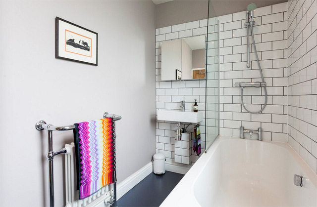
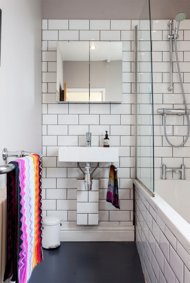
This is the only ‘before’ picture I have of the bathroom, and it’s one of the estate agent pictures from when we bought the house. There was nothing wrong with the bathroom, per se (it was euphemistically described as a ‘luxury’ bathroom in the sales details). But it was so utterly boring and lacking in any kind of character. I don’t know why people don’t have a bit more fun with their bathrooms. They don’t have to be completely dull you know! I hated the shower pump being exposed too - it was a nightmare to keep clean.
Anyway, one of the good things about this room is the huge window above the basin (you can’t really see it in the photo above). We have an unusually shaped roof (and no loft) so the ceilings in the upstairs rooms go right up to the roof. The trouble with this high window is that you can’t reach it unless you’re 7ft tall, so the lady who owned the place before us had fashioned this rope pulley system in order to open and close it, which hung down in front of the basin most of the time. It was my number one priority to get rid of this damn rope, so after much research we discovered what we needed was an electric actuator, the type usually used in greenhouses (!). It doesn’t look too pretty, but at least we can now open and shut the bathroom window using a simple electric toggle switch.
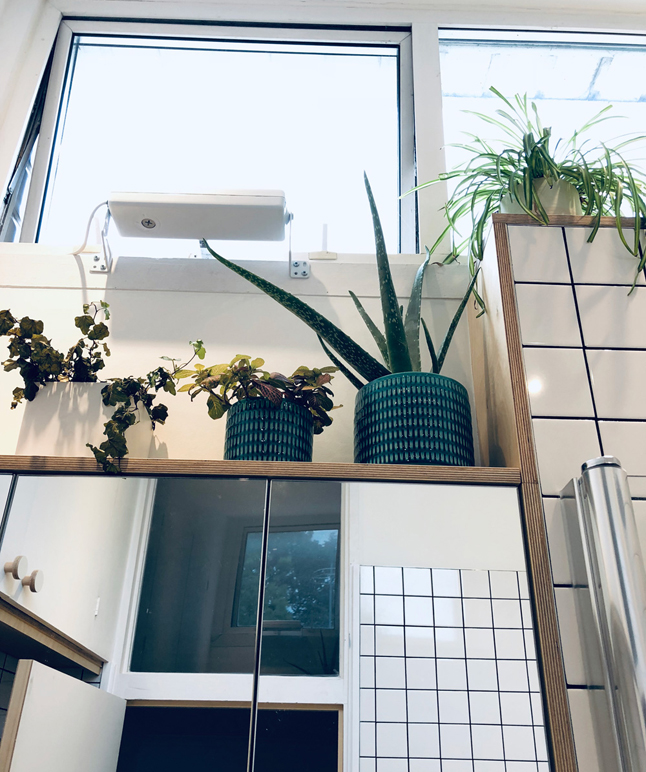

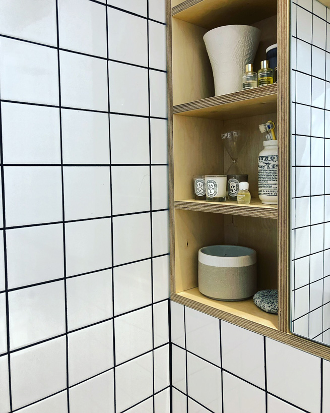
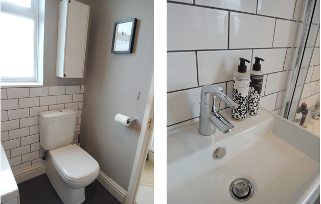
Other than that, our biggest priority was storage. There was hardly any in the bathroom as it was - just that poxy cupboard under the basin. So we decided to hide all the plumbing by building a false wall and above that, creating a mirrored cabinet the entire width of the wall, providing loads of storage. We also removed the old water tank when we had the house replumbed (we fitted a new combi boiler) which meant we gained a huge storage cupboard on the top left of the bathroom - this is basically our only loft space, and now houses all our luggage!

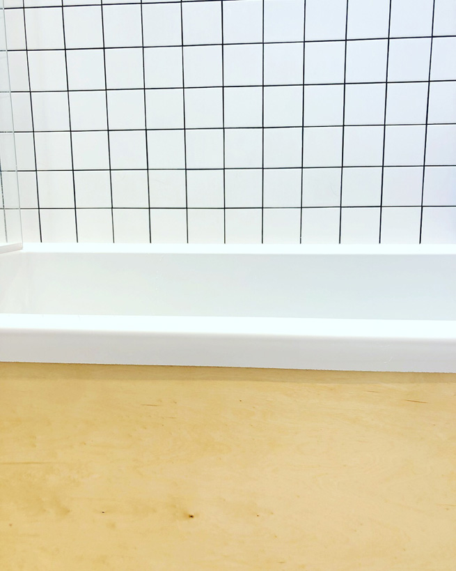
I knew I wanted lots of plywood in this room. I also knew I wanted grid tiles with black grout. It took a lot of persuading on my part to convince the builder (and Oli) that I wanted black grout - and I’m so glad I put my foot down. ‘Graph paper chic’ was what I said I wanted, and I think we got that. With some nice plywood details and a shelf above the mirrored cabinet for my plants, as well as open shelving to the left.
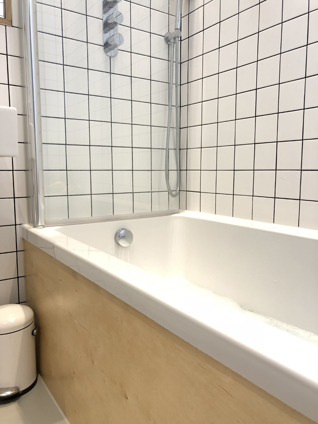
We picked the biggest showerhead we could, and it’s absolutely brilliant. We also have a hand-held shower attachment so we can clean the bath without too much trouble. Sanitaryware wise, we wanted a wider bath (as it’s a shower bath too), and a back-to-wall WC that was as compact as possible. As I said, this room is so tiny. Once we’d squeezed all that in, finding a basin that fitted the space was really hard - in the end we had to go for a largeish cloakroom basin. My dad thinks it’s ridiculous, but sadly a wider one would have made the room feel even smaller.
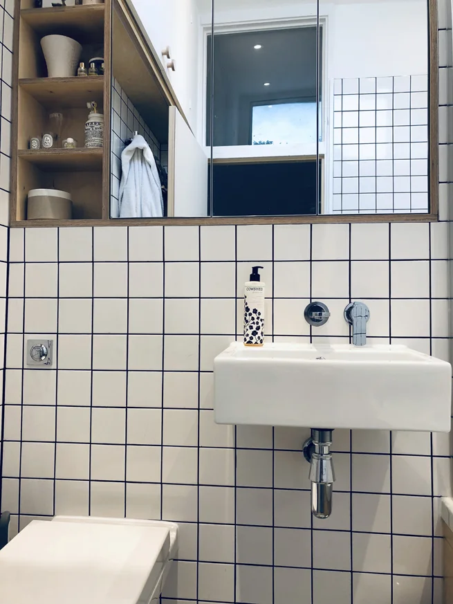
It’s not ideal, and bathtimes with Daph can get a bit stressful as I feel like there’s just nowhere to move sometimes. But I love how light, bright and simple the overall feel of the room is, and the fact that it’s sympathetic to the era of the house, without being too much of a pastiche. We were going to choose cork tiles for the floor, but the style we liked wasn’t recommended for use in bathrooms, so in the end we went for a simple rubber floor. It’s pleasingly clean and neutral but it’s also far too light - in hindsight I would have picked a darker shade, as water splashes show up really badly so it always looks dirty!
Finally, I wanted the biggest towel rail possible, and this is hidden behind the door. It holds all our towels, so we always have something cosy to wrap ourselves in after getting out of the bath or shower. I think my favourite feature of the room is the plywood bath panel - it’s so beautifully finished and I just love the colour of the wood.
Anyway, here’s the great long list of where everything was from, just in case you’re interested. Any questions, leave me a comment! And I promise not to wait another three years before posting any more interiors blogs :)
Basin - Aston Matthews. Taps and shower fittings - Crosswater. Toilet - VitrA. Bath - no idea sorry, builder supplied. Shower screen - Novellini Aurora. Flooring - The Colour Flooring Company. Towel rail - Victoria Plum. Bath panel and cabinet - bespoke. Tiles - British Ceramic Tile. Grout - BAL Adhesive Micromax 2 in Anthracite. Window actuator - Venset. Loft cupboard handles - Chocolate Creative.
The RIVAL is currently available for just 99p in the Kindle Spring Sale! UNFOLLOW ME will be published in June.

Why every writer should have a dolls house*

*Or a dog. Or a kitchen garden. Or an obsession with knitting. Or jigsaw puzzles. Or any hobby that doesn’t involve computers
Those of you who follow me on Instagram or Twitter might have noticed that I have lately become completely obsessed with a dolls house. I have to apologise in advance here – because this post, is going to be about the dolls house. Now, I have had mostly good reactions to my social media #dollshousediaries pictures, with lots of DMs from people saying they’re loving it but I am also slightly terrified there are an equal number of people watching my Insta stories rolling their eyes going ‘shut up about the bloody dolls house woman’.
So sorry. If you hate dolls houses then… well, for a start I think you’re a bit weird because how could you possibly not love them, perfect miniature things of joy… but also, sorry, cos this post is about my dolls house.

My Dad in his workshop
My dad made me my dolls house from scratch when I was 9 or 10. My dad is a bit of a modelling geek. He’s a frustrated engineer who ended up working in software and his way of relaxing has always been to make things with his hands. He’s built model aircraft, model ships and a full-size car and a working, full-size German WW1 biplane in his garage (yes really). He told me that he wished he’d been a carpenter, but he followed the money and ended up working in IT instead, which makes me a bit sad but not too sad as he is always going on nice holidays and has a good pension.
Anyway, this post is not about my dad. It’s about my dolls house. So, as a young teenager I collected bits and pieces for my dolls house, and I loved it, but of course I then discovered boys and the dolls house fell out of favour. Then when I was about 21, my parents moved house and it ended up being put in their garage, boxed in by tons of other Garage Stuff.
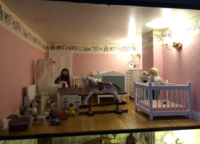
But last year I begged him to unearth it, and he did (reluctantly and a little complainingly). And it is now squeezed into my tiny home office and it is my Favourite Thing (after my partner and my daughter. And the cat, although that’s a close call. Sorry Percy).
“ I am potentially renovating it more painstakingly than I did our actual house last year. ”
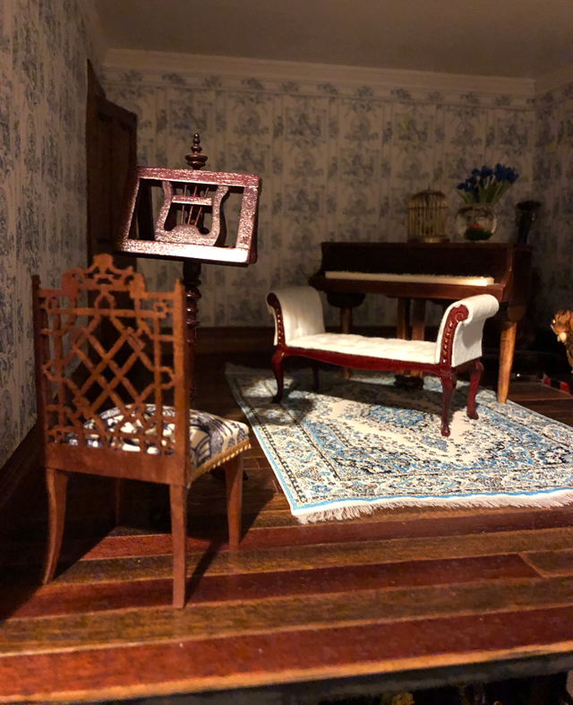
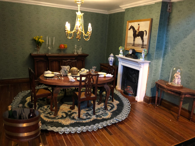
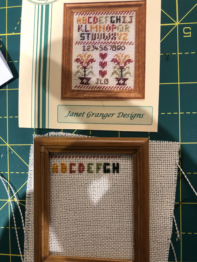
I am slowly renovating it. I am potentially renovating it more painstakingly than I did our actual house last year. It’s quite a big (for a dolls house) Georgian house, and while it was in storage unfortunately some mice took up residence in it, and so some bits of it are a little nibbled and worse for wear. Like any house that’s lain empty for over a decade, it has a few issues. The wallpaper is peeling in some rooms, the carpets are stained. I’m slowly redoing each room, one by one. I’ve started with the dining room, and next up I’m going to do the music room. Each room needs a different amount of work – some rooms need re-wallpapering and new flooring, others just need more furniture and accessories. And this is the best bit – the stuff.
The stuff! There are so many amazing miniature craftsmen out there, making teeny tiny and amazing things. I went to a dolls house fair recently (median age of attendees: 65) and spent £47 on a tiny porcelain vase. I spent the same on a chair that had been hand-carved. I love both pieces equally, they bring me great joy, but they also serve as a reminder that this dolls house is going to bankrupt me.
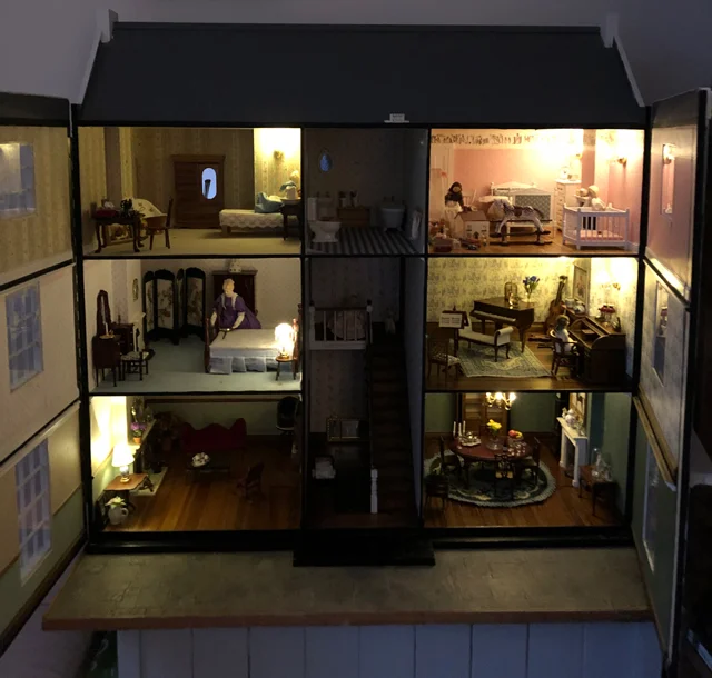
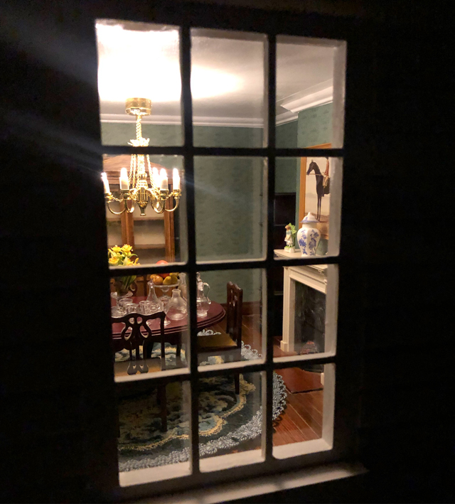
One of the things my father never got around to doing when he first built it was put lighting in. So I have also been gradually adding lights to the rooms – and oh, my – the effect is amazing. But let’s be honest, with this kind of thing, it’s all about the pictures isn’t it? SO here are a few more…

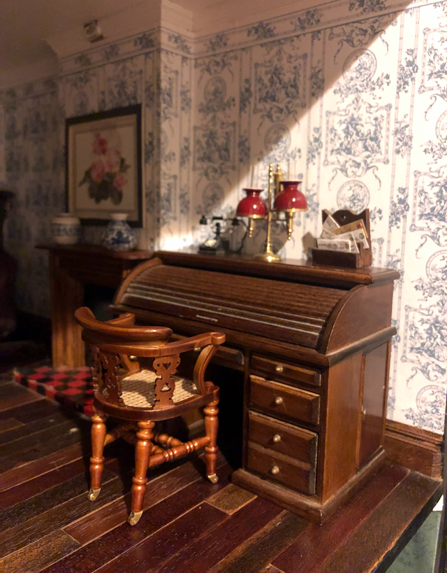
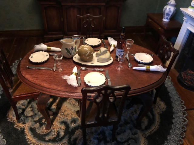
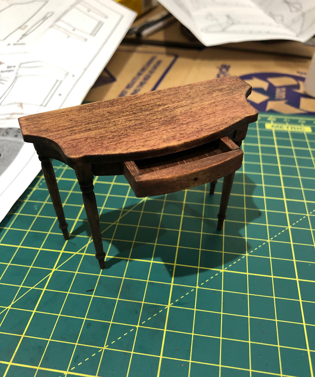
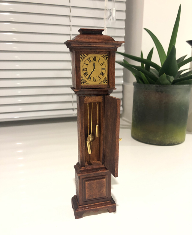
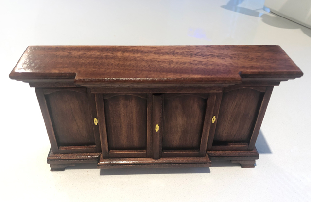
I have become so obsessed, that I also ordered some tiny kit furniture from Germany, and with my own hands made a new sideboard for the dining room, plus a dining table, side table and grandfather clock. I sanded and stained and varnished and glued them together. It’s the most crafty thing I have ever done. I am also currently working on a mini Georgian sampler, meticulously cross-stitching teeny tiny stitches on the smallest canvas known to womankind (and swearing about it a lot).
I was telling one of my oldest friends about the dolls house (let’s be honest, I’m telling anyone and everyone) and she said she thought the reason I loved it so much was because I was in complete control of it. Because as a writer, she said, I had so little control. Of course, writers have control over their output, but whether or not the book will be published, whether or not it will sell more than a handful of copies, whether or not it will be well received… all these things are completely out of our hands. Whereas in my teeny tiny perfect miniature world, I am God, and what I say goes.
“the thing I have loved so much is making things with my hands. And – most importantly of all – being away from a screen.”
She may be right. I am sure there’s an element of that in it. But also, for me, the thing I have loved so much is making things with my hands. And – most importantly of all – being away from a screen. I have spent my working life staring at a computer screen, and it’s horrible – the most unhealthy, lonely, lethargic way to spend your time. But at 7pm each night, once Daphne is in bed, I sit down at the dining room table (much to Oli’s consternation – he objected a LOT to the smell of wood stain in the kitchen) and I fiddle with my teeny bits of wood, and I (sometimes) drink a gin and tonic and I forget everything else. And it’s pure heaven.
You can find out more about THE RIVAL here, and order here if you want to make my day. UNFOLLOW ME will be published in June.
Our (not so) new house!

Finally! It's my long overdue through-the-keyhole post! Sorry it's taken me so long to get this up - to be honest I wasn't really sure how to approach blogging about the house because we've done a few bits before moving in but really it needs a LOT of work, but the budget and time aren't quite there yet. So I thought I'd start with the 'Before' pictures - here goes! - here's what our house looked like when we first got the keys. These pics were taken by Oli, so apologies that they're not hugely professional! They weirdly make the house look quite dark when it is anything but.


A little bit more about it... it's a four-bedroom terraced house in a really lovely little cul-de-sac in a rather pedestrian town in Surrey. It was built in 1969, and is surrounded by £2m BEAST houses, so we think our cul-de-sac was actually the huge grounds of a bigger house that obviously got knocked down and developed on. But this was back in the days when developments were far more sympathetic to their surroundings. As a result, it's just a small string of five houses in a row, all slightly offset, which means we don't completely overlook each other's gardens.
They are 'architect designed' (I used to think all houses were but apparently many are designed by builders and the like) which means they are quite quirky, with asymmetric zinc-topped roofs, and huge windows in all the rooms - the windows originally went down to the floor but the previous owner said it was like living in a fish bowl so she had them changed for more traditional ones. We'd like to get them changed back at some point.

2016-09-11-19-33-56

I think what we love most about it is the quiet! It's such a shock after living in London, where ambulance sirens blazed past at five-minute intervals (downside of living right by St George's Hospital). We also have a garage in a separate block, which we have predictably filled with crap already.


I know that 1960s/70s houses aren't to many people's tastes, but we love the space and the open-plan layout and the fact they are so much cheaper than period properties. We actually also offered on a period house round the corner just before this one - much more 'pretty' and trad and charming with open fires etc, but then we found out it had been underpinned, so we pulled out. In hindsight I am so glad we did as it was on a much busier road - cul-de-sacs are bloody awesome, seriously. I can leave the buggy out the front and never worry someone's going to come along and nick it, and I've also just instructed Amazon Prime to leave things in the porch if we're out (how middle class is that sentence).

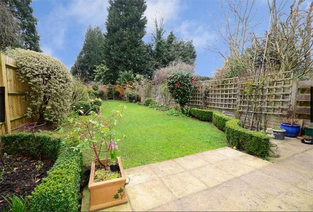
And best of all, is the garden. It's 80ft long, green, peaceful and SOUTH FACING - which was one of our dealbreakers. It is amazing and I'm so glad we moved in before the weather turned so we got to make the most of it.

I haven't got any before pics of Daphne's room as we decorated that pretty much straight away - I'll do a room tour post about it ASAP. The bathroom and downstairs loo are also not worthy of sharing - the bathroom is newish but I find it really horrible and depressing for some reason - I'd LOVE to change it but really we can't justify it.
First of all, we want to build a garden pod for Oli to have as a studio, and then replace the large downstairs toilet with a shower room (there's only one bathroom upstairs). And then change all the flooring - it has cream carpets throughout which are just totally unsuitable for Daph as well as being old and stained. And THEN we have to tackle those horribly upsetting tiles in the hallway and kitchen. I'm not sure what flooring the hallway would have had originally - maybe lino? - as there's just concrete under there. So lots of decisions to make and planning to do. We want to add a 60s/70s vibe about the place, I think, rather than making it super contemporary but we also don't want it to look totally naff. It's quite a challenge!
Review (ish): Setu chair by Herman Miller
 Right so I promised you interiors posts, but I didn't promise you pretty interiors posts (if you want them, may I suggest my friend Vicky's blog Style Made Simple?). I'm starting with this because it's quick and easy for me to blog about (unlike all the decorating/room scheme planning that's been going on and which requires decent photography) but also because it is possibly the most exciting purchase I have made since we moved in. OK, that's a bit of an exaggeration, but it's certainly ONE of the most exciting purchases.
As with most desk-chained work drones, I have had to endure years of backache thanks to uncomfortable 'ergonomic' desk chairs. When I worked at IPC (now Time Inc, but forever IPC to me) and they moved into their fancy new office (which has since been sold off at the same rate as all their magazines) they gave us all these swish Vitra chairs. They looked lovely - all black mesh and sleek curves, but within days I was in agony. I think because I have a ridiculously long back (seriously I can't wear a swimming costume because they don't reach over my nipples), I just can't get on with most chairs that are sculpted to fit. Anyway, we got free physio at work (like I said, this was back in the days when people still bought magazines and there was lots of money floating about) and I took full advantage of this. After using up my six free sessions and still finding work about as comfortable as walking across nails, I complained to my manager, who ordered me a hugely expensive Stephen Hawking-like contraption which, quite frankly, was actually worse.
Oh god, as usual, I'm being ridiculously verbose here - what I meant to say is that I prefer simple chairs rather than someone else's idea of 'ergonomic'. In fact, some of my most comfortable desk days have been sat on a kitchen chair with a cushion under my bum.
But obviously after a while this set-up gets a bit bum-numbing. I have searched high and low over the years for a solution. Just a comfortable desk chair - not too much to ask, right? And then finally I found one in John Lewis. About three years ago - the Herman Miller Setu. I sat on it and it was like being given a great big bear hug from behind. It was LOVELY. I was in love. But I was also wary - much like shoes you try on and prance about the shop in for five minutes that FEEL comfortable, chairs have a habit of turning on you after an hour. The chair was also expensive. Really expensive. I walked away.
But then I came back. Four times. Every time I went to John Lewis I would go and sit in it for as long as I could get away with before whoever I was shopping with wondered where on earth I had gone. And it was always the same: a great big bear hug. So finally, two weeks ago, I ordered one.
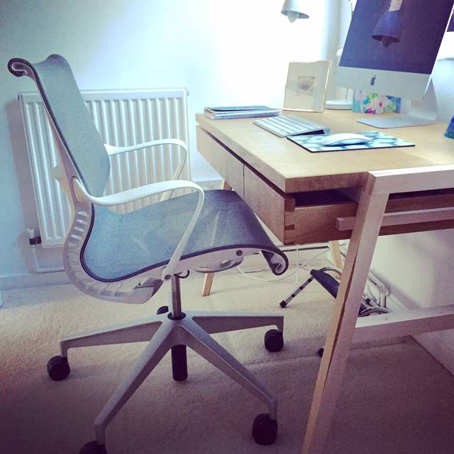
It arrived. I was so nervous. I sat in it but it was just as good as I remembered. Everyone who's visited the new house has also sat in it and sighed in envy. It is a good chair. It's not particularly fancy - in fact the only thing you can adjust is the seat height, but somehow this works. You can't tilt the seat or fix the back or raise the arms but this means you've got less chance of locking yourself into some godawful position which seems comfortable at first but is slowly and stealthily crushing your spine.
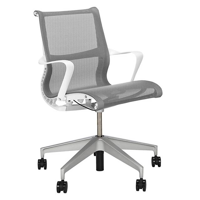
Also, even though I said this wasn't a pretty interiors post, it's a pretty chair right? It's bloody lovely to look at. It comes in lots of sophisticated shades - in fact the 'Berry' one, a kind of navy, was my favourite in the store but after much deliberation I went with the neutral 'Alpine' to match my new office decor.
So yes. If like me, you're in need of a new desk chair and you also can't cover your nipples in a swimming costume, maybe go and have a sit on it in John Lewis for three years too. I reckon you'll be as convinced as I was.
Sarah Hamilton's Just a Card campaign
 I've known artist and designer Sarah Hamilton for a few years now - and in fact I interviewed her about her work on this very blog. She's a wonderfully talented, vivacious and passionate person and when she told me about her latest endeavour - the fabulous Just a Card campaign, I was so impressed.
If you've not heard about it, the campaign aims to encourage people to buy 'just a card' if they go into an independent shop or gallery. So many galleries are closing down because people pop in, have a look around, see the prices of the artwork and feel that to buy something significant would be out of their reach financially. Even if they love the designs on offer, they often feel too embarrassed to make a small purchase - such as a card or some wrapping paper. However, it's these small purchases, when repeated by many customers, that can make all the difference to a struggling gallery owner's finances.
Sarah was inspired to start the campaign when she saw the quote "If everyone who'd complimented our beautiful gallery had bought 'just a card' we'd still be open". The message was simple and clear - if you go into an independent store, don't be embarrassed if you can only afford to spend a few pounds! As Sarah pointed out when we talked about it over dinner lately, you wouldn't be embarrassed to go to Tesco and only buy a mass-produced card, but we know who'd appreciate the purchase more.
I'm passionate about passionate people who turn their passions into their livelihood - it really takes guts and balls, and in our age of huge faceless corporations I truly love to support independent people wherever possible. I've mentioned before my love of Dartmouth (and we're off there on holiday again later this month) - it's my happy place and one of the main reasons is the plethora of quirky independent shops - many of which are art galleries - and all of which I can easily spend hours in browsing. The shopkeepers are always friendly and love to chat and tell you about all the things they're selling - it's so wonderful to know that the things you are buying were made with love and care. I'm not particularly hippy in general but I do think surrounding yourself with things that have a real story behind them lifts your spirits.
I'm so happy to see that Sarah's campaign is really gaining momentum, but if you haven't supported it yet, please do! You can check out the website, follow them on Twitter and keep up to date with their progress on their blog. But most important of all, please do buy 'just a card' if you go into an independent shop or gallery - you really will be making all the difference!
Shops you should know about: Vita Copenhagen
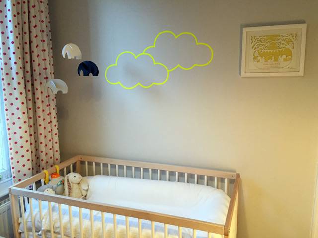
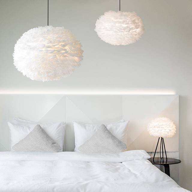 I spent a long time searching for a pendant light for Daphne's nursery, eventually giving up and just re-covering the horrible cheap Ikea pendant we had up there. As I've said, we're hoping to move soon so it made sense to wait until we had a proper nursery for her before splashing out on something nice. But during my research, pretty much the only light I liked was the Eos, by Vita Copenhagen. Made from beautiful white feathers carefully arranged around a frame, it looks a little bit like a fluffy white cloud - in keeping with the cloud decals we already had up on the wall.
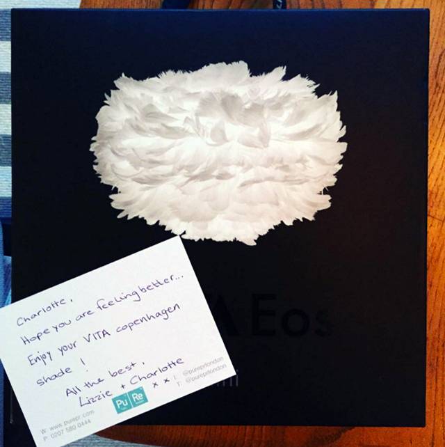
I was pretty chuffed then when the lovely PR for Vita Copenhagen got in touch and offered me an Eos - it was as though she'd read my mind (I hadn't actually mentioned that I liked it anywhere so it was really serendipitous!). When it arrived I opened it and it's even more beautiful than I thought - I've actually quickly repackaged it and stowed it away safely for use in our new home as I don't want it to get ruined when we move.
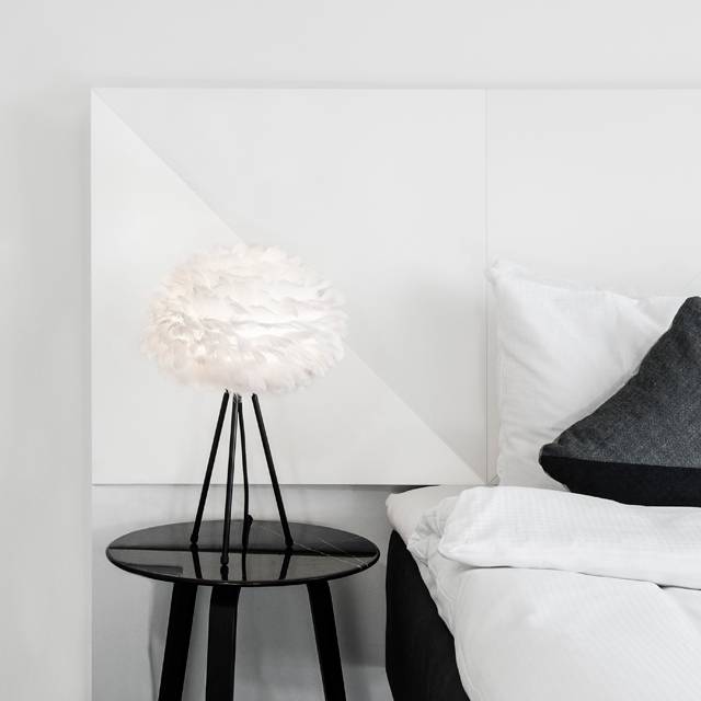
One of the best things about Vita Copenhagen, in my view, is its price points. The lights are all really really good value and have a beautiful Scandi, minimalist aesthetic - I'm a massive George Nelson bubble pendant fan but let's be honest, these cost an absolute bomb. The design-led pieces from Vita Copenhagen look incredibly expensive but are actually very reasonably priced indeed.
They also believe in reducing their environmental footprint, so all their lights come packaged in compact gift boxes to keep logistics and storage costs down. Big thumbs up.
The company is relatively new to the UK (I believe!) and as far as I can see only has prices in euros up on its site at the moment - but do have a look if you're after something supremely stylish (can't go wrong with anything from Copenhagen really can you?!). And I'll share pics of Daphne's light in situ once we've moved - fingers, toes, arms, legs... EVERYTHING crossed, we're hoping to complete at the end of this month...
Daphne's nursery tour
 I didn't really want to do a post on Daph's nursery because it's basically been a bit of a... CHALLENGE. It's a teeny tiny room, which I stupidly while pregnant made even tinier by adding a whole wall of mirrored wardrobes. I hadn't realised at the time that this made it impossible to fit a normal-sized cot bed in. I basically used up the one good wall with these damned wardrobes - while we needed the storage, I really didn't think it through.
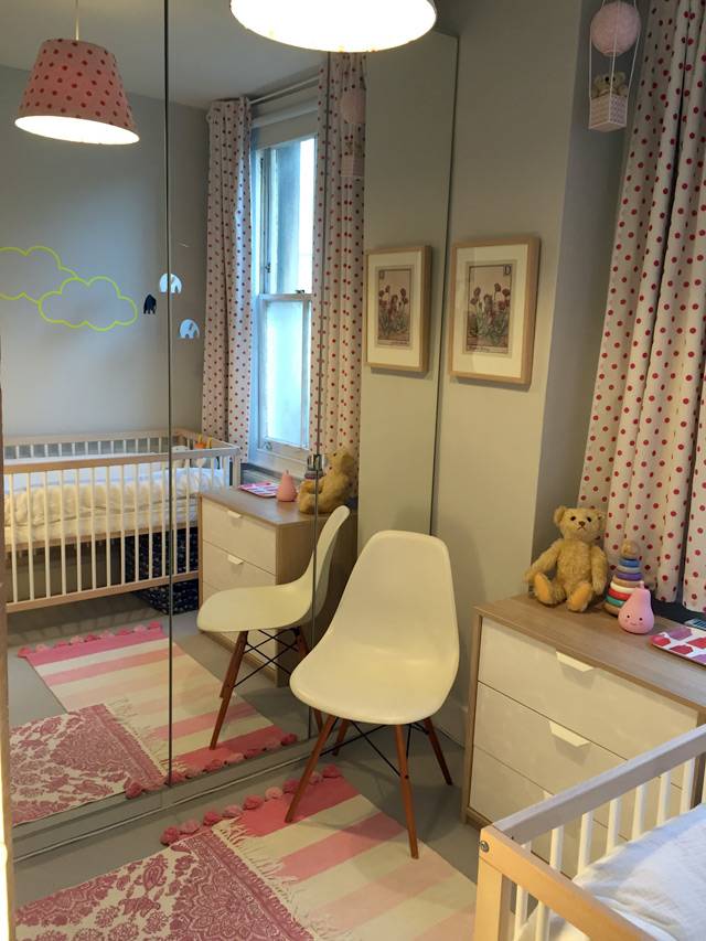
It's also a really weirdly shaped room, with the door at an angle - sort of cutting off one corner of a square. Plus it has an awkward chimney breast sticking out on one wall. Anyway with a lot of measuring and squeezing, we've managed to get in a small cot - the Mokee mini cot in fact - as well as a small chest of drawers and a shelving unit (which we already had). And a chair (although you have to move the chair to get into the wardrobe but luckily I don't need to do it that often!).
It's not the ideal child's room/nursery that I had in mind when I pictured myself as a mother, but despite this, it's actually turned out to be a really cute, happy room. When I'm feeding Daphne last thing before her bedtime, I sit in there and look around at the random mishmash of stuff (and different wood finishes!!) and I can't help but smile. It's ridiculously girly (especially with those pink polka dot curtains that I already had) but it suits a tiny baby girl and I feel like there's plenty for her to look at it, all of which has some story or meaning behind it - as with everything else in my flat.
Here are some more pics... (apologies for the crap photography. The light in this room is also a bit of a challenge!)
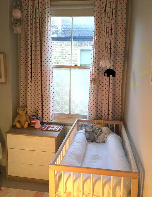
It's a bit cluttered, it's probably a bit too PINK, it was done on a budget, but it's a room full of love. As we're house-hunting this won't be her room for too long (can't wait for more SPACE!), but I think it's quite a good start, and I'm pleased with how we manage to work around the tiny floorplan and create a usable space for her. It's my new favourite room in the flat. I hope she feels safe and happy in there.
Sourcebook: My Bathroom
 The baby is still enjoying a delightful period of night-time wakefulness (basically, wakes at 2am screaming for no apparent reason - beginning to suspect teething; and then 5.30am whereupon she decides it's time to start the day), so I'm a little sleep deprived at the moment. Hence this rather uninspiring post - the last one detailing all the bits and bobs in my home. I've already done a blog post specifically about my bathroom makeover, but here's a list of all the products you can see in the pictures in case you like any of them!
I've decided not to do a similar post on my kitchen as to be honest very little of it is of my choosing - the cabinets are Ikea and fine but not what I would have picked, the worktop is also Ikea and is a white laminate, the flooring is godawful and I have no idea where it's from, the walls are painted in French Gray from Farrow & Ball. If you want to know any more about it then do drop me a line/leave me a comment.
But enough of that, on to the bathroom - done on a massively tight budget, I think it cost me about £2k in materials and then another £1.5k in labour.
Wall colour, Dove Tale, Farrow & Ball Flooring, vinyl in Slate Grey from The Colour Flooring Company Tiles, Topps Tiles Basin, Bauhaus from CP Hart's trade centre All taps and shower fittings, Grohe from Amazon Towels, Missoni Home from Heal's Bath, was existing bath Toilet, Duravit from CP Hart's trade centre Towel rail, Victoria Plumb Cabinet above basin, Homebase Pedal bin, SimpleHuman Cabinet above toilet, Ikea (spray-painted white)
All photos (except the last two) copyright Houzz UK and taken by the supremely talented Chris Snook.
Shops you should know about: the Southbank Centre shop
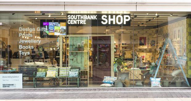 It's possibly a little too late for this post, but I just had to quickly mention the wonder that is London's Southbank Centre shop, in case anyone was still trying to get hold of last-minute Christmas presents! This amazing little gem is tucked away right by the Royal Festival Hall (yay for culture!), slap bang in the middle of a load of chain restaurants (boo for commercialism!). It's brilliant for finding quirky, one-off, design-led pieces that make absolutely smashing stocking fillers.

The focus probably leans towards homewares - lots of fab cushions, prints and mugs - but there's also a really lovely selection of jewellery that's perfect for those who want something unique. When I visited a few weeks ago they also had a brilliant range of unusual and handmade Christmas cards and decorations.

The shop works with social enterprise Cockpit Arts to source products from designer-makers, and refreshes its stock every three months. Meaning you really will find stuff that's not on the high street.
Some of the products are available online but for the true experience you need to visit the actual shop. It's right by the river, and at this time of year the whole Southbank area (my favourite part of London) is covered in twinkly lights so really you have no excuse not to go.
Also, every now and then, a tube train trundles underneath the shop and you think you're in a the middle of an earthquake. Which is mildly exhilarating. What more could you want?
Like what you just read? You can follow me on Twitter or Facebook to be the first to know what I’m up to. And I’ll love you forever!